How to Read Stock Charts for Beginners
Learn how to read stock charts with our beginner-friendly guide. Master the basics of line, bar, candlestick, and point-and-figure charts to boost your trading skills.
Stock charts are a topic of debate among long-term investors. Some view them as unreliable, similar to predicting the future by reading tea leaves. However, others find value in analyzing trend lines, support, and resistance levels to determine the best times to buy or sell stocks. It is either for long-term investments or short positions.
For beginners, the technical language surrounding stock charts (moving averages, chart patterns, and relative strength) can be intimidating.
Despite this, stock charts can be valuable tools for assessing whether a company is worth your investment. Even if you’re not focused on picking individual stocks, these charts help you understand the data that is publicly available.
What Is a Stock Chart?
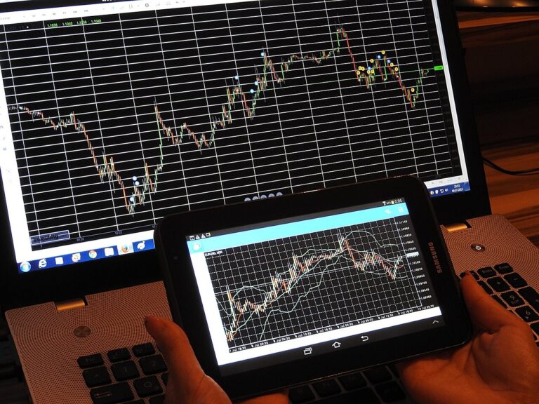
A stock chart is a visual chart of a stock’s price changes and trading volume over time. These charts provide investors with a detailed view of price trends, patterns, and possible entry or exit points for trades. By condensing a large amount of information into an easy-to-read format, stock charts allow investors to evaluate a stock’s past performance and current status.
Typically, stock charts display prices on the vertical axis and time on the horizontal axis. Different types of charts offer unique perspectives on a stock’s performance, showing not only the price direction but also the strength of its movements through volume indicators and price changes.
Different Types of Stock Charts
In technical analysis, four main types of stock charts are commonly used:
Line Charts:
When you picture a chart, a line chart likely comes to mind first. It plots stock prices or trading volumes on the y-axis which is vertical and time on the x-axis which represent horizontal. Trading volume can be refer to the number of shares bought and sold on a particular day. Typically, the closing price of a stock is used to create a line chart. To build one, you first plot a dot on the graph above the specific date, aligned with the corresponding stock price. Over time, connecting these dots with a line gives a visual view of the stock’s performance.
Bar Charts:
Bar charts are like line charts but offer more detail. Instead of dots, they use vertical lines with horizontal lines extending from both sides. The top of the vertical line stands for highest price of the day, while the bottom shows the lowest. The horizontal line on the left marks the opening price, and the one on the right indicates the closing price. Each bar on the chart gives you four key data points, making bar charts particularly useful for understanding price volatility throughout the day.
Candlestick Charts:
Candlestick charts pass the same information as bar charts but in a more visually engaging way. Each “candlestick” consists of a rectangular body with lines extending above and below it. The top line shows the day’s highest trading price, and the bottom line shows the lowest. The body of the candle stand for opening and closing prices, with the upper and lower ends indicating which was higher. Candlestick charts also offer insight into market volatility over time, with the body color showing whether the stock closed higher (usually dark) or lower (usually light) than it opened.
Point and Figure Charts:
Point and figure charts differ significantly from the other three types. They were widely used before computers became standard in stock analysis but are now less common due to their complexity and limited information. These charts focus on price volatility over time. On the vertical axis, they show how many times the stock’s price increased or decreased by a set amount.
The horizontal axis represents time intervals. Marks on the chart are made up of X’s and O’s. X’s show how many times the stock price rose by the specified amount, while O’s show how many times it fell. The specified amount is known as the box size, and it directly relates to the difference between the markings on the y-axis.
READ ALSO: How to Build a Winning Trading Portfolio
READ ALSO: How to Manage Risk in Trading : Essential Guide
READ ALSO: How Technology is Shaping Future of Investment
READ ALSO: How to Build a Large Portfolio as an Investor
Key Elements to Look for in a Stock Chart
Price:
The price section of a stock chart shows how a stock’s price changes over time. Vertical bars in this area represent the range of prices a stock traded at during a specific day or week. A small horizontal line within the bar marks the stock’s current price or where it ended for the day or week. The color of these bars indicates whether the stock’s price increased (blue) or decreased (red) during that period.
Volume Bars:
Volume bars, which are also vertical, show the number of shares traded on a particular day or week. Similar to the price bars, the color indicates whether the stock’s price went up (blue) or down (red). Additionally, a red line in the volume area represents the average number of shares traded over the last 50 days (for daily charts) or 10 weeks (for weekly charts).
Moving Average Lines:
Moving averages are shown as horizontal lines on the chart. A red line typically tracks the average stock price over the last 50 days (on a daily chart) or 10 weeks (on a weekly chart). Another line might show the average over 200 days or 40 weeks, providing insight into longer-term trends.
Relative Strength Line:
This line compares the stock’s price movement to that of the S&P 500, a common market benchmark. If this line is rising, it indicates the stock is doing better than the broader market. If it’s falling, the stock is underperforming compared to the overall market.
Benefits of Reading Stock Charts
Better Market Trend Analysis:
Stock charts help investors spot trends in the market. By studying patterns in price movements and trading volumes, traders can understand the market’s direction and adjust their strategies accordingly.
Improved Timing for Buying and Selling:
Charts can guide investors on the best times to buy or sell stocks by analyzing past price movements and technical indicators. When you Recognize patterns like support and resistance levels it leads to better-timed trades and potentially higher returns.
Identification of Support and Resistance Levels:
Support and resistance levels helps you to indicate on a stock chart which show where a stock’s price tends to stop falling (support) or rising (resistance). Understanding these levels can help investors decide when to enter or exit a trade.
Understanding Stock Volatility:
Stock charts clearly show how much a stock’s price fluctuates, known as volatility. Understanding a stock’s volatility is crucial for managing risk and choosing the right investment strategy.
Recognition of Patterns and Indicators:
Stock charts contain various patterns and technical indicators that signal possible future price movements. Learning to interpret these can significantly improve trading decisions, highlighting opportunities and potential risks.
5 Step to Read Stock Charts
Stock Symbol and Exchange:
At the top left corner of a stock chart, you’ll find the company’s name, its stock symbol (or ticker), and the exchange where it’s traded.
Chart Period:
Stock charts allow you to view price change over different time periods, ranging from intraday (within the same day) to weekly, monthly, or even several years. Traders often use daily or intraday charts for short-term decisions, while long-term trends are analyzed using monthly or yearly data.
Price Changes:
Hovering over the stock ticker will show you key data for the day, including the opening price (start of trading), closing price (end of trading), highest price, and lowest price for that day.
Net Change:
On a daily stock chart, you’ll see the stock’s net price change and percentage change from the previous day’s close, shown in green or red. Green indicates a price increase, while red shows a decrease.
Volume:
Volume is another crucial piece of information, representing the number of shares traded on a given day. High trading volume suggests active buying and selling, while low volume indicates less market interest at the current price.
Conclusion:
Understanding how to read stock charts is a critical skill for any investor, whether you’re a beginner or an experienced trader. Learning how to read different types of charts, such as line, bar, candlestick, and point-and-figure charts will help you gain valuable insights into price trends, market volatility, and potential trade opportunities.
Also when you master these charts it will empower you to make informed decisions, improve your timing in the market, and ultimately enhance your investment strategy. Keep practicing, and over time, you’ll find that these tools can be an important asset in your trading arsenal.